


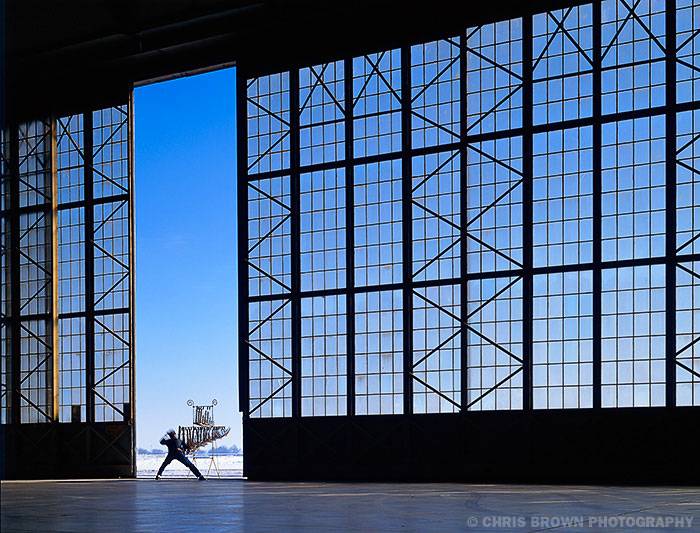
Every town has its best kept secrets. For those of us working in the marketing communications industry, one of those secrets is photographer Chris Brown. When a stock photo just won’t do and you need that perfect image for an ad campaign or brochure, who are you going to call? In Champaign-Urbana, we’re lucky to have a top commercial photographer like Chris Brown living amongst us.
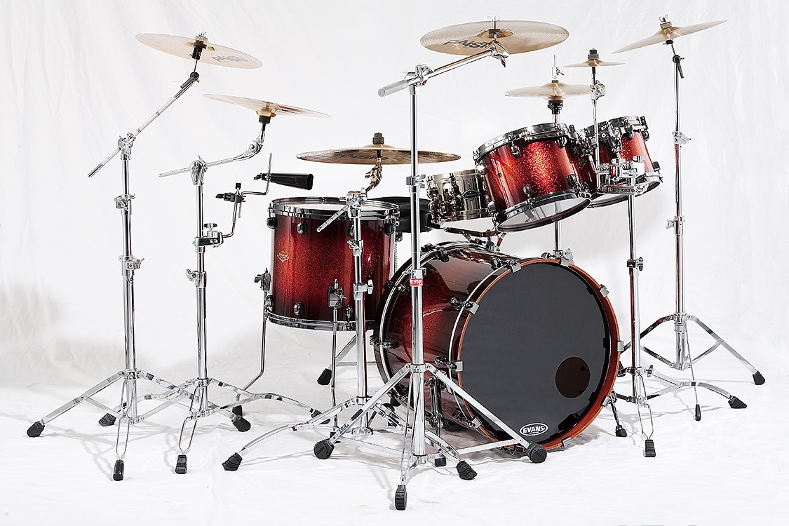
Got a wedding coming up? Don’t call Chris. Need some high school senior portraits? Wrong guy. Chris is not that kind of commercial photographer. He doesn’t advertise, he doesn’t show at galleries, but you’ve probably seen his images all around town — in an ad, on a billboard, or maybe on a web site. Maybe you’ve even seen his pictures in books like Rhythm & Beauty: The Art of Percussion, for which Chris created beautiful portraits of musical instruments, somehow capturing each instrument’s unique personality like it was a living entity.

What I like most about working with Chris is the process of creative collaboration. There are plenty of photographers who can execute your ideas with technical proficiency. However, when working with Chris, it’s best to approach him with an open mind. Somehow, Chris always manages to make your initial ideas better. His ability to give visual form to images of stunning beauty is incomparable. And when it comes to photographing people, he’s got the magic touch. Somehow, he always clicks the shutter at exactly the right moment, the exact moment that reveals something elusive about the subject. To this day, Chris Brown’s quickie portrait he did of me (it took all of two minutes) is still the one photo of me that I like the most.
In preparation for Chris’ upcoming presentation at Parkland’s “Meet the Pros” lecture series, I asked him to answer a few questions about his work over email. Here’s what he had to share:
Smile Politely: How long have you been a photographer?
Chris Brown: I picked up a camera around 1980, dabbled in snapshots along the beaches of San Diego for a few years, then became a first assistant for a couple studios in Detroit. I was supporting myself with the craft by 1988.
SP: Do you consider yourself an artist?
Brown: I do when my work precipitates a discussion of aesthetics or styling with the client. There have been many jobs where the client and I are viewing the images on a monitor and aesthetic suggestions start percolating. It’s fun and can deepen pretty quickly.
On the flip side, I do a lot of catalog photography where the purpose of a single image is to communicate as much as possible about a product. This type of photography is more mechanical. The lighting is to show structure and dimension, and the reproduction of colors must be as accurate as possible.
When making images for myself, the process separates into two different streams: one for showing my commercial aesthetic and another for my personal enjoyment. The tools are the same but the outcome is very different. The most notable difference is that my commercial work is seen almost exclusively in electronic form and my personal work is almost seen exclusively in archival print form.
SP: How is commercial photography different than fine art photography?
Brown: Commercial photography is for commerce and business. It’s highly collaborative and subject to bureaucratic decisions and edicts that you would never encounter when making fine art images.
When making an image that satisfies yourself personally, there should be only one person on earth that passes judgement on the image: yourself.
While there have been clients and agencies who have let a photographer or illustrator have complete creative freedom, those jobs are the exception, not the norm. And even then, the work is confined by the fact that the image will be used to sell a product or brand, and this severely limits an image’s interpretation and aesthetic appreciation.
SP: Do you have any specialties?
Brown: In the central Illinois region I don’t specialize because it would limit the work I have access to. When marketing my work outside the region, I pursue the garden, horticulture, and landscaping markets.
If I could shoot anything my heart desires it would toggle between food, flora & gardens, people, and classic portraits. The reason for this is because after working on a single subject for several weeks, a change is very refreshing and I can explore new techniques and methods.
SP: Do you have a personal style?
Brown: Not that I know of, but my aesthetic eye gravitates towards simpler, more graphic elements within the image frame. I don’t consciously pursue a specific style either, but do try to respond to my gut feelings when working on something.
SP: Are you a creative photographer?
Brown: Hah! I am when the client looks at the image and gets stoked! But when they start to grumble I’m merely a janitor, cleaning things up.
SP: What was the most creative project you’ve worked on?
Brown: Photography for the book Rhythm & Beauty: The Art of Percussion. It was a book written by local musician Rocky Maffit about percussion instruments from all over the world. It was first conceived by Rocky to be encyclopedic in nature, with straightforward photographs (i.e., objects on neutral backgrounds) and recordings to illustrate the diverse nature of percussion instruments and the societies from which they come. Essentially, it was a musicologist’s book on percussion instruments. I’d never heard of musicology nor most of the instruments to be covered, and eagerly accepted the project.
One of the first instruments to be photographed was a very rare metal angklung. Rocky described the instrument to me, its construction and history, and neither of us talked about how to photograph it. Rocky assumed I’d simply plop it down on white seamless, photograph it along with a couple close-ups and be done. I had no preconceptions at this point in the project.
The instrument was delivered to my studio by Robert Chappell, professor of music at Northern Illinois University, during a fierce snowstorm. It was almost 100 years old and visually unappealing, covered with rust, crust, and peeling chrome. Sonically, it’s the most beautiful instrument I’ve ever heard. When I heard Prof. Chappell play the angklung in my studio, I wanted to translate its sonic qualities to something visual.
The resulting photograph changed the creative direction of the book, and served to enthuse both Rocky and the art director, Evelyn Shapiro. After this image was made, every instrument and every spread in the book was given substantial visual consideration on how to better communicate the qualities and history of each instrument.
SP: What was the most challenging client brief you were commissioned to solve?
Brown: Most recently, a client wanted to show a white bar of soap amidst white suds. He wanted there to be this bright, clean feel to the image. Then it was going to be printed on the back side of a postcard, which is uncoated card stock.
We worked on photographing the scene for four or five hours, then spent the better part of a day retouching and proofing the image to get the best ink density for the highlights. Although the challenge was mechanical in nature, it was still a challenge. Ultimately, the client had to settle for higher ink density in the image to get it to stand off the card stock and balance with the other elements on the card.
SP: When photographing people, how do you make them look so good?
Brown: On set with people, there are three factors that determine someone’s look: styling, lighting, and the subject’s comfort level. Of the three, the person’s comfort level is the most critical. This is even more important when the subject is not a professional model.
You can have great styling (hair and makeup), and great lighting, but if the subject is uncomfortable, that’s what will be conveyed in the final image. In addition, if the image is used for marketing or promoting something relevant to that person (e.g., the company they work for), they will never appreciate its use. They’ll simply remember how much their photo session reminded them of their recent root canal. Although there is always retouching, nothing can alter something like that.
Retouching is now ubiquitous in all areas of photography, but it cannot replace good quality styling, lighting, or a person’s comfort in front of the camera. When these three factors of a shoot are established, retouching is simply a perfunctory step in the process.
SP: How do you promote yourself?
Brown: I use email promotions using iContact, and send out postcards and digital prints to select prospects.
The best promotion, though, is word-of-mouth. Once a job is complete I might ask the client if they know of anyone who could use my services.
Referrals by peers are very valuable. Most prospective clients who I’ve been recommended to never ask to see my portfolio. A referral and my website galleries are enough to get a meeting or project brief.
SP: How has stock photography affected your business?
Brown: Stock photography has never diminished my business because everything I do is product- or person-centric. I can’t remember the last time I shot “filler” material for a client.
Cheap stock imagery is due to affordable digital photography. Almost everyone has a camera now. If you have a cell phone, you have a camera. People who would not have owned a camera twenty years ago, now have one. I think this is great. Although we see thousands of poorly executed images, we also see much better work. There’s a large morass of junk pics out there, but the pinnacle of great work is higher and better than ever.
One trap I’ve seen designers fall into is when a stock photo is used as a placeholder and the client then becomes attached to it. This forces the designer to either use an image they didn’t intend to, or hire a photographer to replicate the image without infringing on copyrights — a fine line that never fully satisfies the client. Now that anyone can pull a photo off the web and drop it into a layout, marker “comps” and sketches are rare. The major benefit to a comprehensive layout made with felt-tip markers is that the designer can be wonderfully creative and, at the same time, very exact in the use of an image. This allows the designer and client to develop a marketing piece with flexibility and without preconceptions.
SP: I understand you also do some graphic design?
Brown: I do, but currently only for a couple clients. When I became interested in photography in the early ’80s, I was interested in the application of photography in advertising. That led to me getting an A.A. degree in graphic design. It helped tremendously in understanding the elements of design and how images are used within its parameters. It also revealed the mechanical process of image reproduction and its inherent limitations.
In the early ’90s, I was asked to design and produce product sell sheets and catalogs by clients who didn’t have a relationship with a graphic designer or agency. By the end of the decade I was producing eight catalogs, fifteen national ads and ten product sell sheets annually between two clients — including acquiring printer bids, mailing lists, and photography. All in an effort to serve the client. Nowadays, though, I devote my energy to photographing their products, which is more fulfilling to me.
SP: Is there a relationship between design and photography?
Brown: When a design utilizes photography that enhances the overall communication of the piece, then the sum is greater than the individual parts.
SP: What do you do when you’re not taking pictures?
Brown: Drums!
Chris Brown will be speaking at Parkland College on Wednesday, October 10 at noon in room C118. Chris’s presentation is the seventh event of “Meet the Pros,” a creative lecture series presented by Graphic Design at Parkland College and sponsored by CUDO and 40 North 88 West. This free lecture series is open to the public and features designers, photographers, illustrators, and other commercial artists in our local creative community.