


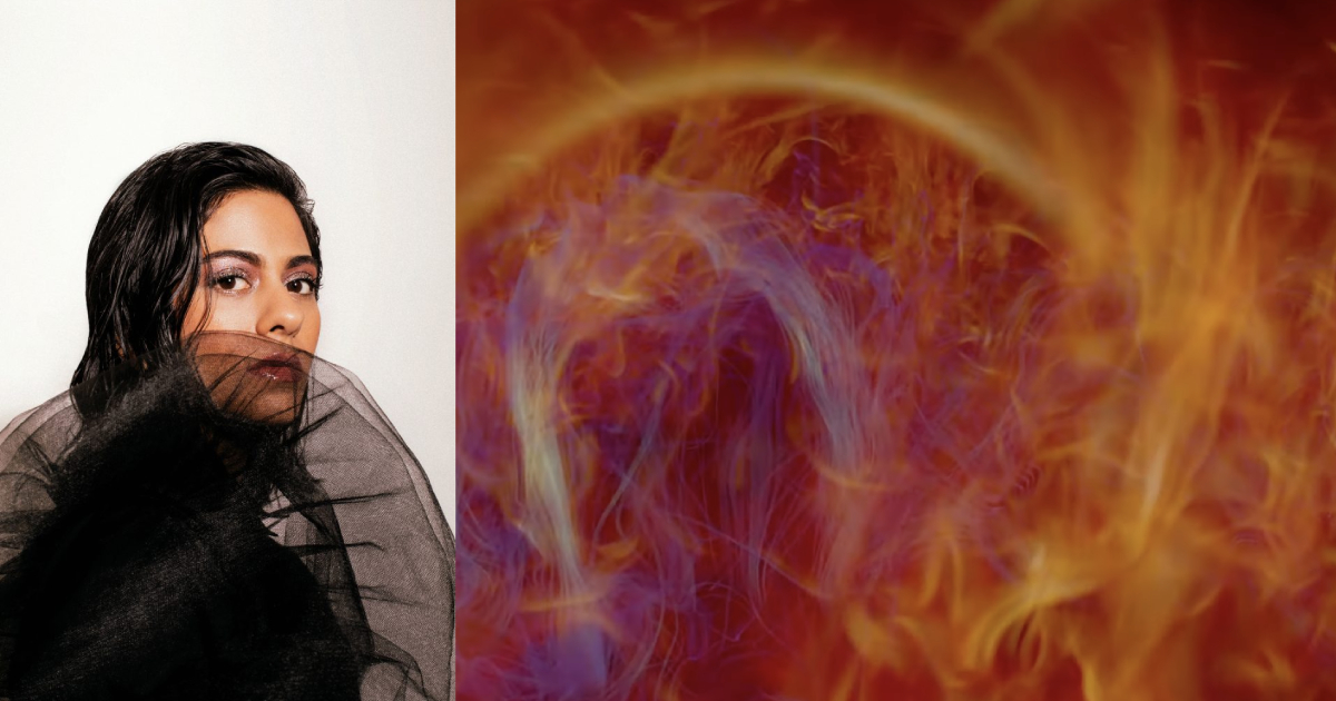
One of the PYGMALION performances I’m looking forward to is Arushi Jain with the University of Illinois National Center for Supercomputing Applications (NCSA). Jain is a musician, radio DJ, and modular synthesist. She draws on the Indian raga, which is melodic classical music, and reinterprets, remixes, and reinvents the idea for digital synthesizers. The result is music that simultaneously points back toward non-Western classical traditions, while pushing forward into Western digital technologies and modes of sound making. It is quite literally mood music, both historically and in Jain’s contemporary interpretations.
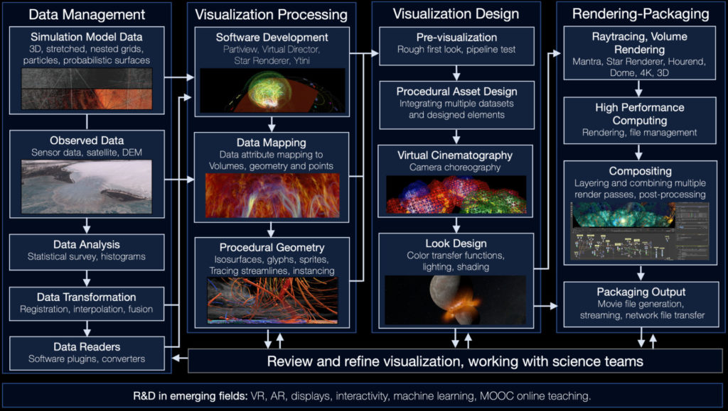
I mentioned NCSA, which will be doing the visuals for this show. How is something so ephemeral, so personal, like Jain’s music, visualized? I recently chatted with Kalina Borkiewicz, Director of NCSA’s Academy Award-nominated Advanced Visualization Lab (AVL), who gave me some details. The AVL has produced many visualizations, usually for documentaries, but will be making real-time ones specifically for this performance, set to Jain’s music. Thursday night’s event will be completely unique, one-of-a-kind, and special. It will be a hyper-sensorial experience, all about the vibes (so come prepared for vibes), and it’s certainly not to be missed. Get your tickets before they sell out.
This interview has been edited for length and clarity.
Smile Politely: Forgive my ignorance, but let’s start with the basics. What, exactly, does the Advanced Visualization Laboratory do?
Kalina Borkiewicz: The AVL works with all kinds of scientific datasets (galaxies, tornadoes, molecular structures, etc.) and turns them into beautiful imagery — the kind that you see in museums or in documentary films. We’re housed at the National Center for Supercomputing Applications, so we often work with big data and cutting-edge science. We’re a “Renaissance team” of programmers and designers who make complex science topics not only easy to understand, but also engaging and exciting.
We’ve contributed to films including Atlas of a Changing Earth, A Beautiful Planet, Seeing the Beginning of Time, and museum experiences at Spurlock Museum, Chicago’s Museum of Science and Industry, and Adler Planetarium. We even received an Academy Award nomination for our work on Cosmic Voyage!
SP: What made your team want to collaborate with Arushi Jain?
Borkiewicz: AVL has been involved with PYGMALION for the last three years, and the NCSA has for even longer. We’ve tried to find a partner/venue that would make sense for a collaboration each year. AVL’s first year, we partnered with Desert Oracle and we provided visualizations of heatmaps, climate change, trees in Africa, and other on-theme imagery. That year’s event was successful, but was a very simple project, as we had just put together a series of existing visualizations to fit the performance.
This year, our collaboration with Arushi Jain is different. We are creating brand-new visualizations for this performance, and we have been working on it closely with Arushi. She has a technical background herself and uses a lot of technology in her actual performance, so we understand one another and have put together a shared vision for the event. She is sharing data from her performance with us, which we’ll be using to drive real-time computer graphics that will be displayed on a projection screen behind her. Arushi and the AVL team have been working together and this is a true collaboration with a lot of creative juices flowing on both sides.
SP: What has been most exciting about this collaboration?
Borkiewicz: This collaboration is a great match. Arushi is a highly-technical artist, and her music is mesmerizing and often slow, like many of our visualizations where we fly a virtual camera through the majesty of space. It is a perfect pairing! We’re having fun branching out from our usual type of work to do something new and exciting.
SP: Can you talk me through the process of creating the visualizations?
Borkiewicz: At a higher level: the first step is to get our hands on data. There is always a large data processing effort that happens at the start of projects, for us to analyze/understand the data, translate it into something that we and our software can work with, and to pull out interesting features in the data. Then, we focus on design. There are near-infinite possibilities for how you might visualize a dataset (what colors to use, where to place the virtual camera, how to represent the data, etc.), so the designers on our team come up with an artistic vision for how to interpret and convey the data. There is a lot of back-and-forth at this point between the art and the tech side of the work, with us developing software tools to support building the artistic vision. After the design is complete, there’s the question of how to convert the 3D scene into its final format, whether a video (in which case we often use a supercomputer to render the images), or an interactive experience. Every project is different, but those are the general trends.
SP: What makes this collaboration different from the typical scientific visualizations your team does?
Borkiewicz: Our goal with this collaboration is to create data-driven art that enhances the musical performance. This is very different from how we approach most of our other projects, where we aim to educate people about science through data visualization. In both cases we are creating images out of data, but for very different reasons!
Technically speaking, this is a very different project, as well. The visualizations that we work on are typically in the form of videos. A video is made up of frames, a sequence of images. Each frame might take ten minutes or more to generate; time is not really a big constraint. We can take hours or days to generate the final video, and once it’s generated, it can be played back months or years later. By contrast, these visualizations will be live, interactive, and generated in real time. Real-time graphics requires creating images at 30 frames per second, or more! Creating these types of graphics requires an entirely different mode of working, with different tools and techniques. And since the visuals are generated live, they will never be exactly the same. This performance will be a once-in-a-lifetime experience.
Arushi Jain in collaboration with NCSA’s Advanced Visualization Lab
Krannert Center for the Performing Arts
500 S Goodwin Ave
Urbana
Th Sept 21st, 7:30 p.m.
$20